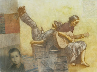
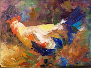
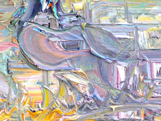
And here is the final result. I'm pretty happy with it and the colors and everything, though I only worry that the type isn't readable. I don't have that much experience with type though so although I searched I couldn't find anything else that had quite the look I wanted. I also shortened some of the stories so I could make it bigger.
Jessica Rich's Blog
Tuesday, April 5, 2011
Monday, April 4, 2011
More Progress on the Instruments Project
Well, I haven't gotten all that much farther on the project, but then the backgrounds took quite a bit longer than planned because I started enjoying it. I basically made them from different concrete textures layered on top and brushed over a whole bunch. The painting on top on the instruments themselves I'm trying to make look like lightly colored field sketches, like the one with the spyglass. I'm not sure if it looks good enough though... I'll probably make some changes later, and the type is still being decided on though I think the one on the spyglass is what I'll go with.
Wednesday, March 30, 2011
Gouache Research
I feel like gouache is one of the lesser known paints, perhaps because of the strange name, which comes from the Italian word “guazzo”, or “water paint”. It was originally used long ago to illuminate manuscripts or sketch outdoor scenes. In the golden age of illustration it was used in magazines. From what I’ve experienced and read, gouache is a lot like watercolor in that it uses water as a solvent and goes on similarly, but it’s much thicker and less transparent. It’s also unique (and sometimes more difficult in some ways) because it’s color changes when it dries. The darker colors lighten generally and the lighter colors darken. Because of this it’s usually best to get the whole painting done in ones session or remember what colors you used. The advantages however are that it has a very quick drying time and can also be rewetted for changing if needed. Because of this the painting is easy to alter and mix on the painting itself(even after days and months) and it’s possible to get some pretty smooth transitions if needed. Like most other paints, gouache can be applied in many different brush stroke types, though impasto isn’t much of an option and it may crack if applied too thickly. It’s a pretty smooth paint and good for backgrounds or underpainting. The texture of the dried paint is a matte, suede –like finish.
The first artist I looked at was a modern user of gouache, Erik Tiemens. For the most part he uses a mixture of media, combining gouache with watercolor and ink pens, but I think the effect he gets with it is amazing. The colors he uses are vibrant and you can tell that the textures he uses varied, either getting a nice smooth wash or a definite brush stroke out of the gouache or watercolor. For the most part he does landscapes and scenery.
Another current artist I found was Thomas Paquette, who also does a lot of scenery but paints in a very different style, though still beautiful. For the most part he uses mid- to lighter-tone pastel-like colors in all. The textures he uses are mostly smooth—actually he does most of his strokes in smooth, thicker strokes and the edges in between seem very… melty? You can tell he paints wet on a relatively smooth surface with definitive, roundish edges. It’s a unique style, and I like it a lot.
The last artist I found was Racovskiy Nicolay. He uses some more variety in subject, but many of the best ones were scenery again. He paints in a very smooth way, especially in the sailing boat painting where he painted on a textured paper. Gouache really can get a variety of textures and the lighting effects he uses with it are very nice.
Oil Lift Out Research
Oil liftout has been one of my favorite traditional techniques of all time. The particular version of the technique I’m trying to mimic this assignment seems complicated but for some reason it makes things (especially tying all the colors together in the one painting) easier. This technique, first involves a value drawing—pure value, no color, usually done in pencil (often brown prismacolor) and a flat guache color wash over each shape. In other words, the colors itself have no value but the prismacolor beneath show through and provide the value. Then a semi-transparent dark oil wash is overlaid to cover the entire painting in the darkest value that will be used. The oil is then left to dry for a little while till it’s almost dry but not quite and the light values are taken out by an eraser to reveal the color of the guache beneath. Colored pencil of whatever color and be used to fix or add to the drawing to make it clearer or add texture. The brush strokes themselves vary depending on what brush is used to paint over the guache with the oil and what kind of eraser strokes the artist is using. The paint is all slightly transparent so there is often that beautiful layered look, though the texture is almost spongy looking. Also, the eraser can never take out all the oil so some of the oil color will remain mixed with the guache. That’s why the colors are all tied together so well and also why the painting sometimes ends up a darker value. You can also end up with some really great intense lighting effects though.
One of the artists I researched when looking for examples of the technique is named Robert Barrett. One painting in particular I found very beautiful. As does classic liftout, it was a deeply colored painting with many subtle layered values from the different oil colors he used to cover the guache. The lights contrasted highly with the darks and the lines of color were very graceful. (This painting is the one with the ballerina putting on her shoes.) The thing I love most about this artist is the color shifts he uses in the oil and the almost rainbow glass look gives. Unfortunately, due to google search being stupid or maybe I somehow wrote his name down wrong, I can’t find any of his paintings again, even though at one time they were the first thing that came up on the oil liftout list. All I’m finding are paintings of naked women or something and it’s annoying. It was my favorite example too...
Another artist that made it big as an illustrator because of this technique is Mark English. He also had a style that involved a lot of beautifully subtle color shifts. He used a very wide range of subjects and styles, but it’s easy to pick out the ones he used this technique for. There is one painting advertisement of Mark Twain that I thought was especially amazing. The only reason it’s not here is because I can’t find the thing again. The face of Mark Twain is done almost entirely in the colored pencil over the oil paint. Others he’s done are of the typical dark chroma and have more of a somber, smoky look.
The last artist I looked at was Todd Kenton Yoder. He also paints a variety of subjects, but most of his are nostalgic looking paintings of people or families or bands playing musical instruments. Much like the previous artists, he uses different colors of oil over the guache to create variety and subtle beauty. I think one of the things I’ll liking most about how this technique looks is the fact that most of the shadows will be the same duller color while the contrasting light colors will be varies and beautiful. They also have a soft, worn quality to them I really like. It suits paintings of scenes from the old days.
Instruments--Progress
For this final project I'm doing in my digital illustration class, the idea is to create a series of four scientific looking illustrations of four different instruments that could have been discovered at any kind of dig. Because I'm a die-hard Peter Pan fan I decided to make my instruments from things Pan and the Lost Boys stole off of the pirates and made into musical instruments. This is what I have so far, and all I have to do now is tighten the detail on these things and paint them, probably in a sort of oil lift out technique probably.
Friday, March 25, 2011
Impasto Research
Impasto is a technique commonly used in fine art where the artist puts the paint so thickly onto the canvas it becomes three-dimensional. They’ll use a brush or a palette knife to put it on and sometimes mix the paint right on the canvas. The effect is that the thick brush and knife strokes affect the way the light plays on the canvas and the texture is much more dramatic or expressive. It’s best painted with oils because of their thickness and long drying time, but acrylics can also be used. It doesn’t quite work with the thinner paints like watercolor though. The brush strokes can vary according to how broad or skinny the brush is but the most common way to paint impasto is using very impressionistic, broad strokes and leaving much of the detail to chance and imagination.
One artist I admire is Arnold Chao, a modern artist from San Francisco. I like the individually unique technique he uses. The brush strokes in his abstract or landscape paintings are often very thin and swirled. He turn the brush around in curves to create even more of an interesting texture with the thick paint. Also, much of his work is loose and slightly vague, as if the viewer is seeing the scene through a heavily textured glass. I like the sunset especially.
Another artist I found is named Maryanne Jacobsen. Her subjects are primarily landscapes and still lives when it comes to impasto and I’ve found those make the best impasto paintings because not a lot of small smooth detail is needed.
And the last artist I researched was Marcus Krackowizer another modern contemporary impressionistic artist. I especially love his artwork because the impasto paint he uses for his work is always full of many different colors and up close the paintings will look like abstract works of art made up of gobs of brushed paint but they become something beautiful from farther away. He does a lot of landscape or city scenes in thick oil, though most of his nonrepresentational art is in thickly applied and almost tie-dyed looking acrylic. It’s amazing what marks these artists can make on the canvas.
Subscribe to:
Posts (Atom)


